

Picture your best customer. It’s a July afternoon in North Carolina, the air conditioning just quit, the house is 84 degrees and climbing, and she’s standing in the kitchen with her phone in her hand searching “AC repair near me.”
She is not at a desk. She is not patient. And if your website makes her pinch, zoom, and hunt for a phone number, she’s going to hit the back button and call whoever made it easy.
Here’s the uncomfortable part: most HVAC company owners have never actually experienced their own website the way that customer does. You built the site years ago, you look at it on your office computer once in a while, and it looks fine. Meanwhile, more than half of your potential customers are meeting your business for the first time on a five-inch screen — and some older sites are quietly failing every one of them.
The failure modes we see over and over
We review a lot of North Carolina service-company websites, and mobile problems fall into a few repeat patterns:
The shrunken desktop. The site has no mobile layout at all, so a phone just displays the full desktop page scaled down. Text renders at the size of a fortune-cookie fortune. Every link is a sniper shot for a thumb. This was the norm for sites built before about 2013 — and plenty of them are still out there earning money pages they can’t cash.
The forgotten “mobile site.” In the early 2010s, many companies launched a separate stripped-down mobile site (you’ll see the address change to something like /phone/ or m.yourcompany.com). A decade later, those sites are still redirecting mobile visitors to a skeleton version of the business — often with different phone numbers, missing services, and none of the pages you’ve added since. Your desktop site and your mobile site have become two different companies.
The buried phone number. The single most important element on a service company’s mobile site is a phone number a thumb can tap. If your number is an image, trapped in a header graphic, or three screens down, you are charging customers a toll to give you money.
The un-fillable form. Tiny fields, no field labels, a submit button that doesn’t work on iOS — if you’ve never filled out your own contact form on your own phone, you don’t actually know whether it works.
The 10-minute test
You don’t need an audit report to find out where you stand. You need your phone and ten minutes.
- Search like a customer. Open your phone’s browser (not the Google app you’re logged into) and search for your main service and town — “furnace repair Winston-Salem,” “AC replacement North Wilkesboro.” Where do you show up? What does your listing look like next to your competitors’?
- Open your site and don’t touch anything. Can you read the headline without zooming? Do you know within three seconds what company this is, what it does, and where?
- Try to call yourself. Find the phone number and tap it. Did the phone offer to dial? If the number is text you have to memorize and retype, that’s a lost after-hours emergency call.
- Find a price signal. Financing, service plans, “free estimates” — can a customer find any reason to believe they can afford you?
- Fill out your own form. All the way through. Submit it. Did it work? Did you receive it?
- Check every page, not just the home page. Services, about, contact. On older sites, it’s common for the home page to be mobile-friendly while the money pages — financing, maintenance plans, specials — still serve the desktop layout.
If you failed even two of those, so did your customers. All of them, every day.
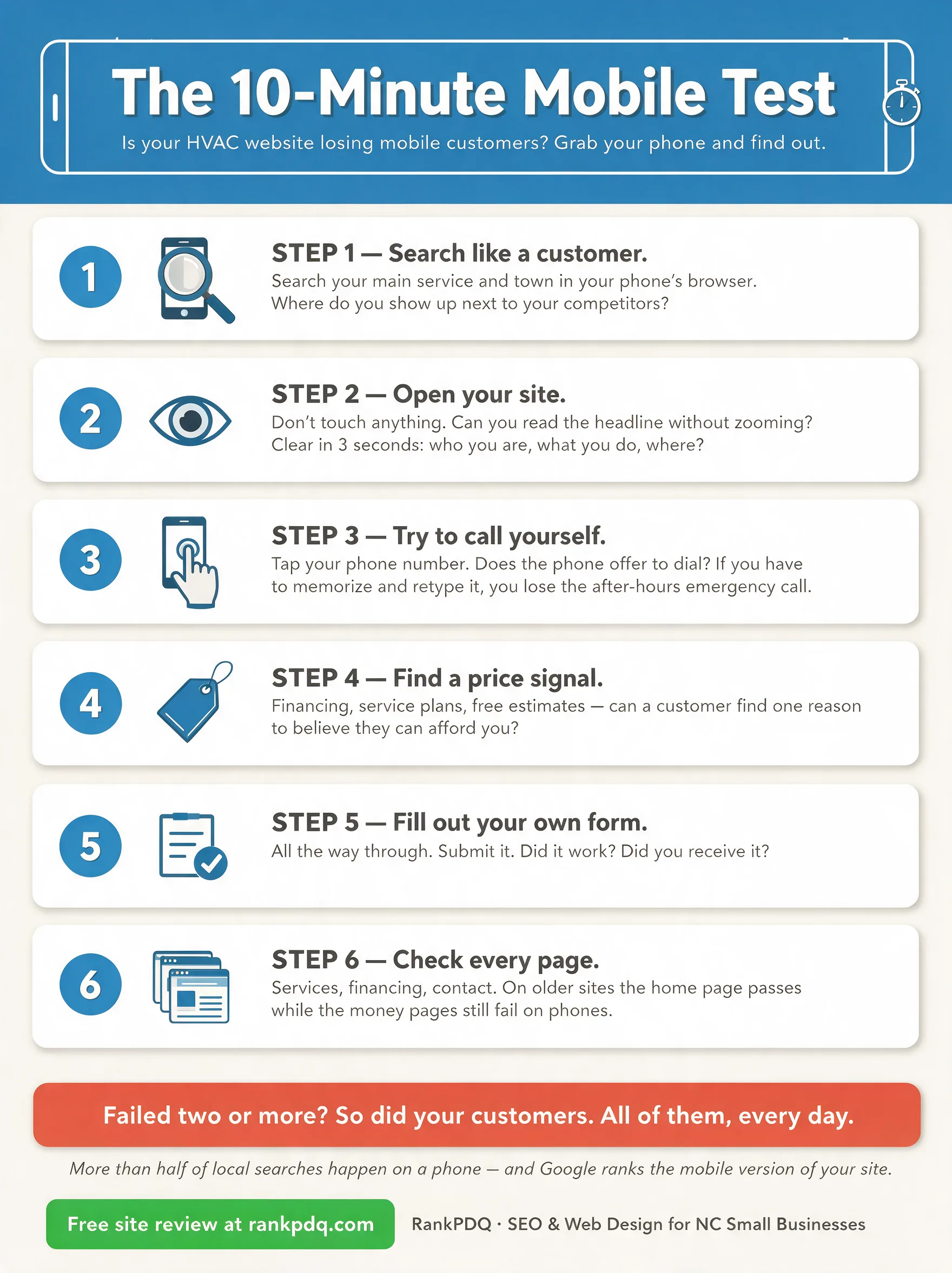
The whole test on one page — feel free to save, print, or share it. (Tap to view full size.)
Why this is also a rankings problem
Google indexes the mobile version of your site — not the desktop version. That’s been true for years. If your mobile experience is broken, you’re not just losing visitors after they arrive; you’re losing the rankings that would have brought them. Page speed, tap-target size, text readability, and layout stability on phones all feed the same machine that decides whether you appear above or below your competitor.
In other words: a mobile-hostile website loses the click and loses the ranking that produces the click. It’s a double leak, and it compounds every month.
What fixing it looks like
Sometimes the fix is surgical: a click-to-call button, a working form, compressed images, a handful of layout repairs. Sometimes the honest answer is that a site built in 2012 can’t be patched into 2026, and a rebuild — done correctly, with redirects that preserve the search equity you’ve spent years earning — costs less than the customers the old site is quietly turning away.
The only wrong move is not knowing which situation you’re in.
If you run an HVAC or home-services company in North Carolina and you’d like a second set of eyes, request a free site review. We’ll look at your site on a real phone, the way your customers do, and send you a plain-English summary of what we find — what’s fine, what’s leaking, and what we’d fix first. No obligation either way.
And if you want to go deeper on the search side, start with our step-by-step SEO guide for HVAC companies and our guide to creating great SEO content for your HVAC business.